
Project Overview
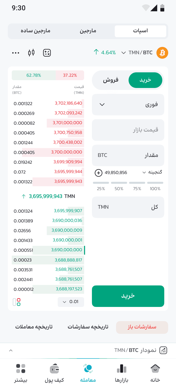
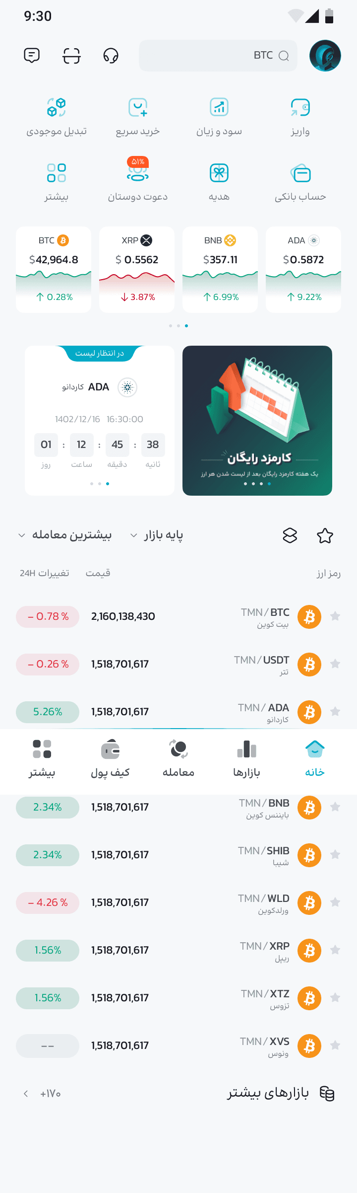
Exnovin is a digital currency exchange platform with a user base of over 1,000,000. The project included redesigning the website, web app, and mobile app, as well as launching new features and products. The platform also underwent a rebranding from Exnovin to Oppodax.


Challenge
The main challenge was to redesign a large crypto exchange platform with over 1,000,000 users that had no design system, inconsistent user interface, and weak user experience. The platform needed to support both Persian and English languages, offer light and dark modes for long user sessions, and handle a smooth transition during a major rebranding. There were also technical limitations, as some important components and metrics like spacing, stroke, corner radius, and RTL support were missing in the initial design system.
Solution
To solve these issues, I reviewed Fluent and Spectrum design systems and finally chose Material Design 3 for its flexibility and documentation. I customized Material 3 to add the missing metrics and RTL support, and started the redesign with the website, then continued with the web app and mobile app. The process was data-driven, using analytics, user feedback, and the Google HEART framework to improve usability. I also provided both light and dark themes, allowed users to switch between the old and new versions, and selected a custom font for better readability in both Persian and English.
Desgin Process
Our design approach followed the proven Double Diamond methodology, ensuring a thorough understanding of the problem space before developing innovative solutions.
01
Discover
Problems
02
Define
Problems to solve
03
Design
Potential solutions
04
Deliver
Feasible solutions
05
Distribute
Product and track metrics
Impact & Results
The platform redesign and rebranding resulted in significant improvements in user experience, engagement, and platform reliability.

+300%
1,000,000+
Registered Users
Active users across the platform

+35%
User Satisfaction
Increased after redesign

Light & Dark
More Personalization
Better accessibility for all
My Design Approach in Figma
For this project, I set up my Figma files using a clear and organized workflow. Auto Layout was used everywhere to make the design flexible and easy to update. All layers, components, and variants are named carefully for better readability and teamwork. I managed Colors, Core-metrics and typography with variables, so any changes stay consistent across the whole design. Components and variants help me build and reuse UI elements efficiently. At the final stage, I prepared a detailed handoff for developers, making sure all assets and specs are ready for smooth development.


